The TWK Design Workflow: Part 2 of 2
In Part 1, Matt explained how we go about putting together a comprehensive content strategy for our website whilst also establishing who we are designing it for and what the client wants.
We have also clarified the hierarchical structure of the site and, thanks to a concise sitemap, we know the content that will go into the website and have a strong visual concept to work from.
Here we will take you through the final stages of the design workflow, including sketching and wireframing, fleshing out our design vision, and finally creating a working prototype ready for the client to see. Let me guide you through the process…
SKETCHING & WIREFRAMES: DON’T JUMP STRAIGHT IN!
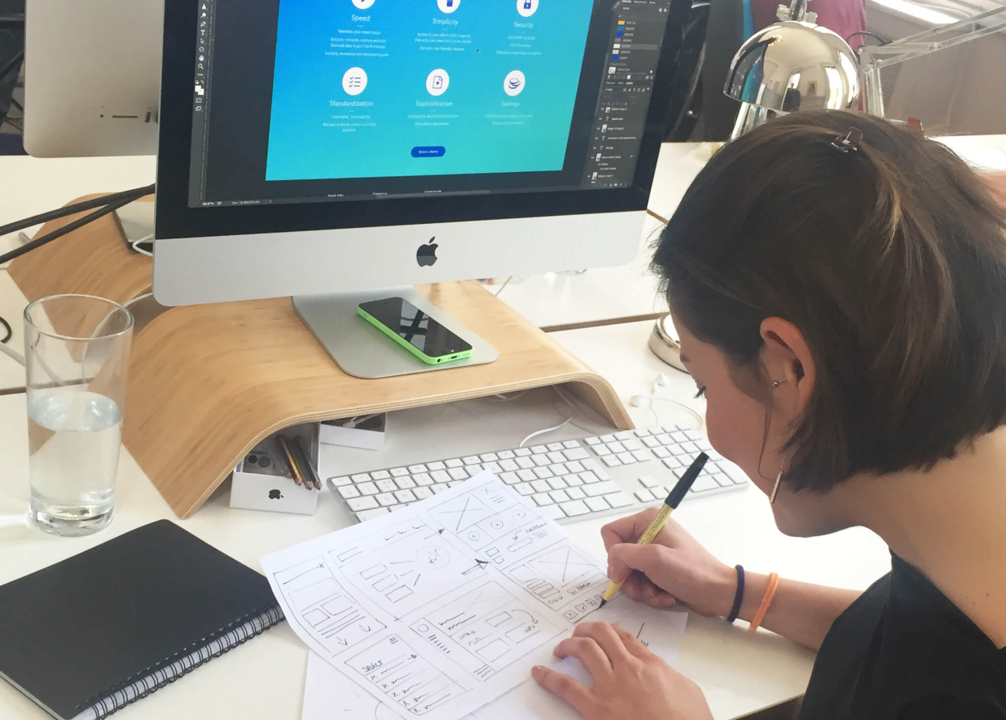
What we are aiming for at this stage are crude wireframes – essentially labelled boxes of content that are devoid of design or visual styling. The purpose of the wireframe is to lay out the overall structure of every page of the site. It’s important to spend time at this stage because the information we want to deliver to the user has to be clear, even in a black and white structure. By designing a wireframe for a page, you can visualise how the different components will interact and how they will work relative to one another. Sketches and notes can be useful to provide further information about user journeys, especially if we need to clarify a specific interaction or piece of functionality that will be used.
As hard as it sometimes feels – don’t be tempted to skip the wireframing stage. A beautiful design will come unstuck if the structure hasn’t be carefully considered!
Now that we have a clear idea of how our site will be structured it’s time to transform this simple information into a unique design vision…
DESIGN VISION: WHAT ARE THE KEY CONSIDERATIONS?
Choosing a typeface
As Matt mentioned in Part 1, it’s important to have a clear understanding of the client’s brand assets and the brief provided. Sometimes clients may not even have any existing assets like fonts or a colour palette and in that case it’s our job to decide these things. At this stage, font choice is really important as you really need to know what you are looking for and why. In simple terms, if your client wishes to come across as traditional or respectable, you may choose a serif typeface. Alternatively, if they wish to present themselves as modern and forward-thinking, you may feel a sans serif typeface is more suitable.
Fontea and Typekit are two handy apps that allow you to sync fonts from Google and Adobe straight into Photoshop. This gives you the possibility to try out different fonts directly in your design, switching between options before picking the one that works best. Remember though that just because thousands of web fonts are available to you, doesn’t mean that you should use them just for the sake of it. Apart from looking great and on brand, typography’s main aim is to make text easily readable for the user.
It doesn’t matter how cool a title looks if it’s difficult to read. You’re designing for readers, not to impress other designers.
The basics of colour
Colours are another key aspect of the design and can often be the hardest decision to make.
Whenever possible, I start designing with one colour that I like and build the colour palette from there. If you try and start with a broad, untested colour palette you’ll often find it harder to create harmony in the design. It’s also important to remember that the way we perceive colours depends on the context in which we see it. Adobe Color is a great tool that helps me every time I’m looking for inspiration before creating a new colour scheme.
The way a colour displays depends on the contrast of the colours surrounding it. Always test your colour palette in a variety of situations to ensure it will be flexible enough to suit your needs!
Now that our design vision is ready, it’s time to talk it through with the client. You don’t always get the chance to meet the client face-to-face so to ensure key aspects aren’t lost, it is important to choose an effective way to present the design.
WORKING PROTOTYPE: BRING YOUR DESIGNS TO LIFE
InVision is a tool we use to turn our designs into interactive prototypes. Once your designs are ready you can easily upload them as screens and share them with clients and colleagues. From here it’s very easy to collect feedback and apply changes to the designs by replacing the screens. This is clearly a huge improvement on the old-fashioned method of attaching jpegs to emails!
But InVision isn’t just about ‘upload and share’ – that wouldn’t be much of a prototyping tool! When it comes to functionality, it’s clear that InVision has been created by designers themselves as it offers some great tools for presenting your designs. Here are few examples of how our design workflow has improved since we started using InVision…
- We now create project folders that sync directly between InVision and Dropbox, meaning we don’t even have to upload our designs. Simply save your design and InVision will automatically update!
- Clients sometimes struggle to understand specific bits of functionality or effects as it can be hard to explain how these will work. InVision allows us to simulate certain scrolling, hover and menu effects which really help bring our designs to life.
- InVision contains a conference call/screen share tool, allowing us to present prototypes in real time and walk people through how a website will look and work. This is really helpful, especially when you need to guide the client through the hierarchy of the site or the design in general.
- Lots of devices are supported in InVision and we particularly love presenting mobile designs. You can send your client a link to your mobile designs by text message, giving them quick, easy access to an accurate responsive design.
As a designer you have most likely been working with an iMac… but take the time to test designs on all screen resolutions, to ensure the site will display the way you intend it to!
The client might require a few changes and this is the perfect time for collecting feedback and tweaking the design. It’s easier to make them at this stage and not when the design will be coded. Thanks to this process and these tools we are able to get the designs signed-off and begin the development phase.
In case you missed it here is THE TWK DESIGN WORKFLOW: PART 1 OF 2 and look out soon for the next post on the development process.
If you have more questions please feel free to contact the design team!


